Trinity is a new Christian liberal arts college in Louisville, Kentucky. Its branding needed to reflect the legacy of Trinity Colleges in the past as well as the values of this new institution.
- Client Trinity College of Louisville
- Concepting Carrie Scrufari & Peter Scrufari
- Design Carrie Scrufari
- Web Design Peter Scrufari
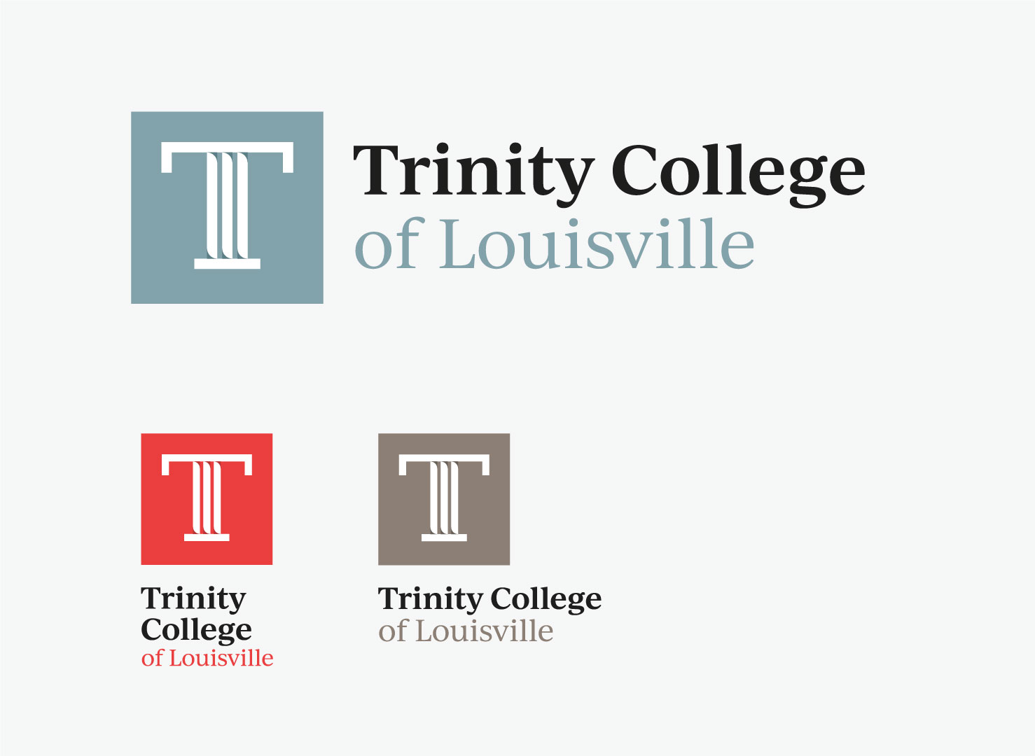
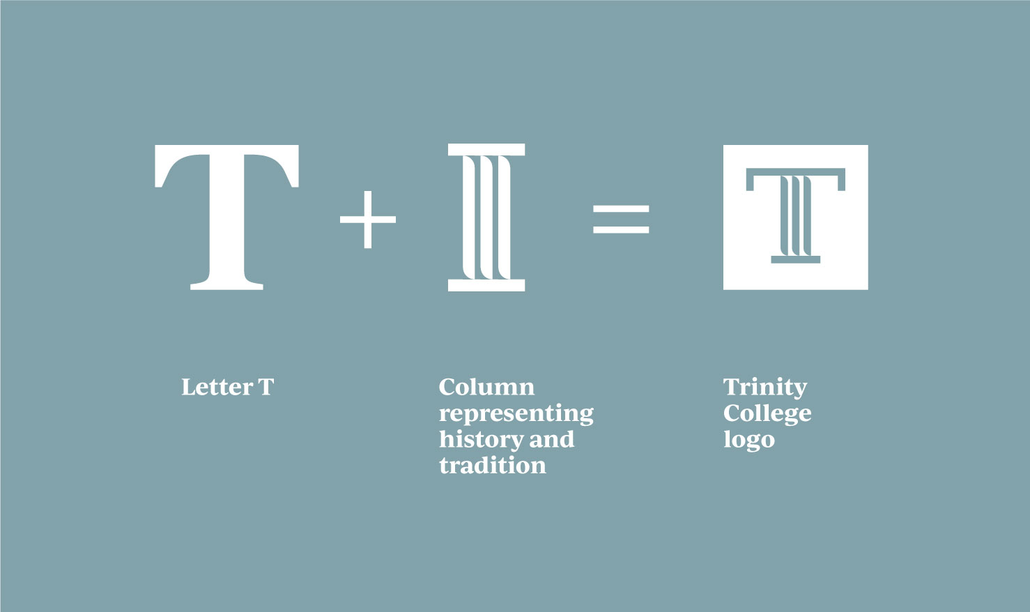
The logo combines the letter T for Trinity with the emblem of a column, representing history and tradition. Together they form a unique logo mark. The square shape and modern colors along with a serif typeface all combine to create an identity that is both rooted in history and modern in style.
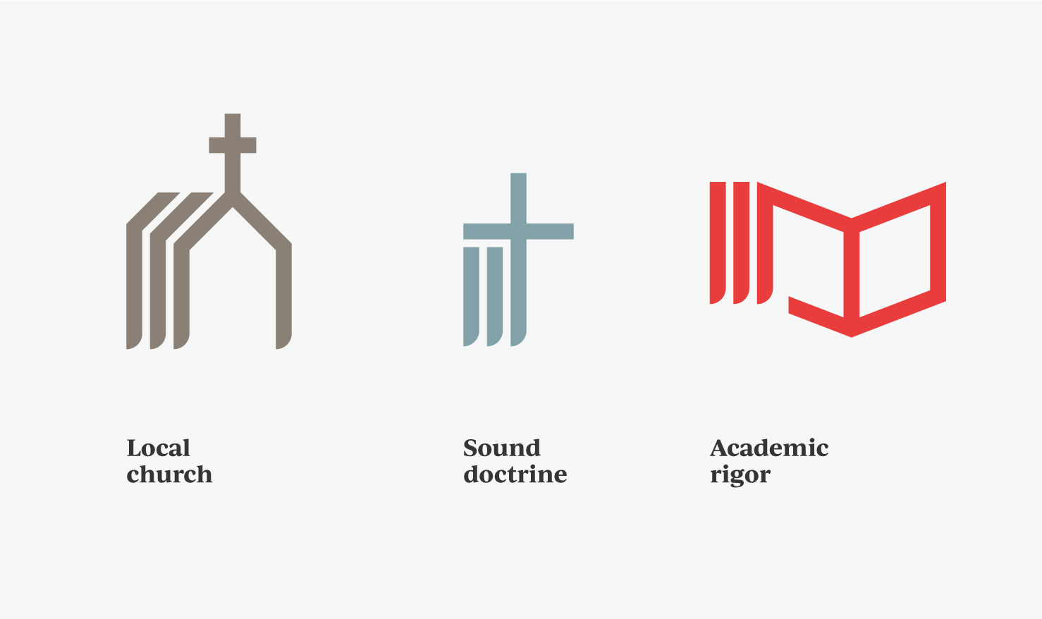
Along with the logo, the vertical lines from the column element form the backbone of three icons representing three key values of Trinity College: the local church, sound doctrine, and academic rigor.

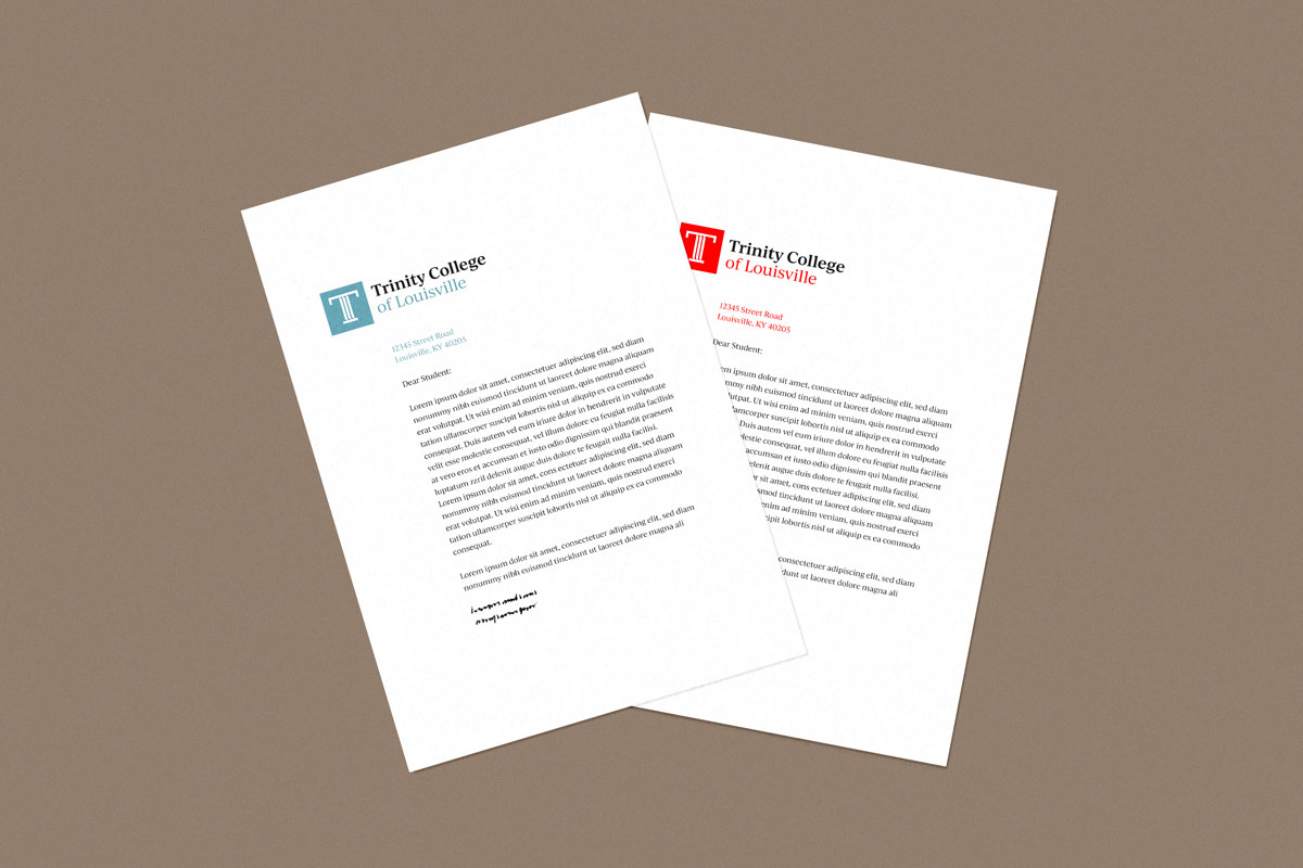
The icons, square shape from the logo, and color scheme can be used in a variety of ways throughout Trinity’s communications.


The T logo mark on its own is an eye-catching visual that lends itself well to many design applications, including t-shirts and other swag.

The logo mark and icons can pair with photography and pattern to create unique combinations within a consistent identity.